
As part of our ancillary task we have to create a film poster depicting our new film. We decided that before we create our final poster we would attempt drafts to realise the full potential and to decide on what photos, layout and text we wanted to use. Below is a first attempt with an image that Hollie took. We really liked the image and feel it captures the essence of a famous band with the crowd and the stage. We like the layout with everything like reviews and film festival logos at the top leaving enough room to appreciate the image and the title. Having features like that exaggerates the films popularity and how good the film will be, this is further established with names like "NME" and "Dave Grohl" who are all big in the music world one way or another. In accordance with our research we had to include reviews because that is what the audience expected from a film poster, we also felt it was important none-the-less.
Including things that the audience expects narrows the chances of people having negative opinions about the poster which could have negative effects on the magazine and trailer. However, some aspects of this poster would not be allowed to be included in our final poster because they were not created by us. For example The Film Festival logos. The text within the logos can easily be recreated by ourselves, its the crest around the outside.
I had a go at recreating the crest on Photoshop and below are the results;
Moreover the logos at the bottom such as MTV and Film 4 are also aspects of this poster that will have to be recreated, but not necessarily the same, we could potentially make up company logos just for the reason of aesthetics. I feel by having said logos gives the poster a more powerful image as its supported by major companies in the field and even if they're fictional companies it still gives the same effect.
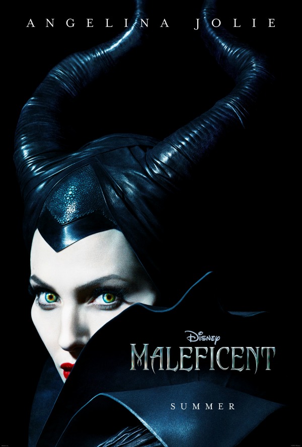
Take this poster for the Disney's 'Maleficent' proudly sporting the Disney logo above the title. Just by seeing a companies logo can automatically give the film positive connotations and brings with it its already massive fan-base. This is the same thing we're trying to do with ours by including company logos somewhere on our poster.
There are some aspects of our own poster that we would change. Namely, the light shining on the band. This photo was taken by Holly at a concert she had recently attended. We believed that the poster would benefit more if the light was brighter, really defining the band from the thousands of fans around them and making them stand out from the busy background. As well as having the band stand out more we would like to make the poster, which is being held up by a fan, bright also. The poster says "I Won't let Your Memory Go". This can be easily spotted by the audience and foreshadows what is to come in the film. It could suggest anything could have happened to the band but you just don't know until you watch it. Its almost like a clue to allow the audiences' imagination run wild.
Now we have had a go at producing a movie poster, we can separate the positives from the negatives and look to avoid the negatives. Having already tried it can also mean we have more experience and can anticipate what to expect like; how much time it takes, what we need to include and how to accomplish it.
Its important to test the market before and get audience feedback, important because it gives you a sense of what the audience desire or think about your work and then you can cater to what they say. We ask a few people what they thought about the film poster draft.
Here's the first person we asked;
What do you think about our poster?
The poster looks good, wouldn't look out of place in a cinema. With the use of basic conventions, it helps sell your movie/trailer towards the target audience.
Anything you would change and why?
"The main thing I would change would be the overall image brightness. I feel it could be a bit brighter, meaning it would stand out a bit more"
The person above isn't really a music fan, he knows a few famous bands but knowledge of the music world is limited. He would fall into our secondary audience category which is why we asked him, instead of only asking primary audiences. None-the-less his feedback was appropriate and helpful.
What do you think about our poster?
"It looks great actually, could be a bit brighter though"
Anything you would change and why?
"Like I said it could be a bit brighter, but I wouldn't change much more, i love the picture."
This person is a big music fan and plays in the same band as me (Alex) so i trust his judgement and knowledge. He would be a primary target audience.
We asked a third person just so we have a range of feedback;
What do you think of our poster?
Its too dark, but the picture looks really good, i love the audience in the photo,
Anything you would change and why?
"Maybe put abit more stuff at the bottom, give it more substances, you know like the reviews and stuff"The third person, again, is a primary audience and this time is girl. Its important to get both genders opinions to see the contrast and then to find an equilibrium, otherwise if we ignore one gender then potentially half the target audience is lost.
No comments:
Post a Comment